Creating video games is a very long and complicated process. As you can tell from my GOTY lists, some of my favorite gaming experiences of the year come from indie games. Some indie games are so well made that they pass for full-retail, commercial games from large companies regardless of how many people actually worked on them. Most indie games have that distinct "indie feel." For the purposes of this article, I'm not talking about a free spirit quality untethered by obligations or unnecessary outside influences. I'm not talking about trends in artistic styles either. I'm talking about the little design details that reflect the "inexperienced" side of indie developers. I'm writing this article to show that sometimes the smallest, thoughtful decisions separate the masters from the apprentices.
First, a passage from the Iwata Asks on Zelda: Twilight Princess.
AONUMA: But there really are times when a stone is placed somewhere for absolutely no reason whatsoever!MIYAMOTO: And when I find one of them, I'll always ask: "Why was it put here?"IWATA: And the answer is usually: "I just felt like it." (laughs)AONUMA: I know, or "I just thought I'd put it there" is another one. (laughs)MIYAMOTO: I'd actually be happier if someone said: "It looks good, don't you think?" (laughs)IWATA:"I just felt like it" really is the worst possible answer you could get!
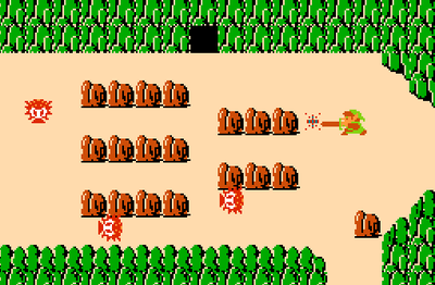 Can you find the out of place rock?
A designer must be guided by strong design philosophies. If one were to just design games haphazardly, chances are the end product will be unfocused at best. Nothing is as straightforward as it may seem because video games are complicated. Changing one small mechanic or adding one rock into the field can do a lot more harm than good.
The following are game design trends in indie games that help create that indie feel.
Hitbox Design
Understanding great hitbox design requires understanding that video games aren't real. Everything is an artifice. Every collision, every movement, and every object is a mere calculation. We coat games with distinct and often familiar forms to help the player make sense of the gameplay objects/actions. And even with arbitrarily designed and abstracted game worlds, we relate to the systems through our own lived experiences (solid objects can't pass through each other, etc.).
So, though there are no hard and fast rules, designing hixboxes that aren't 100% precisely matched up with the visuals is an advanced way of meeting the player half way between the virtual world and the real human player. Take Super Mario Brothers (watch this video to see the hitboxes in motion). Mario's hitbox that defines his personal space is slightly smaller than his standing height. The reason is that the very top of Mario is his hat, not his head. This slightly smaller size hitbox also helps Small Mario fit into 1 brick high spaces with ease.
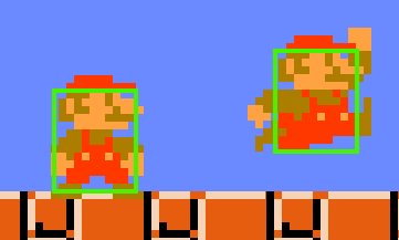
When Mario JUMPs he strikes a rather iconic pose sticking out his arms and legs. It would be a mistake to change the size of Mario's hitbox to encompass his outstretched limbs. Not only would this add more complexities to the game (which history has proven to be unnecessary), but Mario's expanding size would make it harder for players to maneuver around enemies, objects, and tight spaces. Think about it this way. Mario's hitbox is technically a block. Super Mario Bros. is a game quantified by the brick unit (read more about it here). This uniformity helps players gauge challenges and fall into the groove of the game.
Additionally, Super Mario Bros. is a 2D game, but the Mushroom Kingdom is a fictional 3D world. We understand that the clouds are in the background and other elements of the game world exist in a specific plane in 3D space. So if we understand that Mario gets hurt when enemies make contact with his body (or chest), then we also naturally visualize that his outstretched arms and legs poke out into the non-interactive layers. So keeping Mario's hitbox the same when JUMPing or standing is the best solution to match the fiction/form to the gameplay.
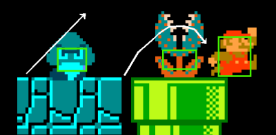
Notice how the Goomba and Piranha Flower hitboxes are squished. The Gooba's hitbox is much lower than a brick tall because the top of the Goomba's head is curved. Instead of designing a round hitbox or stacking a small box on top of a medium hitbox to create a small pyramid, the hitbox is simply squished to compensate. This design allows players to barely avoid contact when JUMPing creating a "rounded" feel. Likewise, the Piranha Flower hitbox is very small allowing players to JUMP through the snapping jaws without getting hurt (see image above). You may be surprised to see how small this hitbox is, which goes to show how the simple design can make the enemy "feel" completely solid yet open between its teeth.
Designing intelligent hitboxes isn't always about reducing hitbox sizes. The Super Mushroom powerup has a large hitbox that pokes out from the curved top very unlike a Goomba's hitbox. This design makes it just a little easier to grab this powerup, and it also fits the gameplay. Unlike a Goomba, if you touch a Mushroom from any angle doing any action you get powered up. Because the relative positioning isn't important, the hitbox doesn't have to compensate. One must be careful when exaggerating hitboxes. I'm looking at you Snake!
Now for some examples of indie game hitboxes could use some tweaking.
- Super Meat Boy: I've found many platforms and places with very questionable hitboxes. Some characters stick to walls that aren't there. Other times there are invisible spots that kill you. I think the bandaid hitbox is too small and the warp zone hitboxes too big. Though I appreciate the extra help with the warp zones sometimes, passing through but not grabbing a bandaid is very frustrating.
- Jumpman: In this innovative platformer with floaty and wild player control, if the very pixel of your outstretched foot touches a pixel of an enemy you're dead. Based on cases like this, I think some of the hitboxes need to be adjusted. After all, I've been killed by enemies on the other side of walls in this game.
- Flywrench: Most of the hitboxes in this game are very clean and accurate to the visuals, which is great for Flywrench's design. However, I distinctly remember the blue keys/gate switches to be particularly hard to hit because of a very small hitbox.
- Megafied: Makoto's World [Beta]: This list would be incomplete if I didn't offer up an example from my portfolio. While we designed most of the hitboxes well, there are still a few we need to tweak. For example, when Makoto ducks, her hitbox doesn't get any smaller. So while it looks like you can avoid some hazards by ducking, you really aren't doing anything.
In part 2, I'll cover more trends and more indie games. Stay tuned.
Article originally appeared on Critical-Gaming Network (https://critical-gaming.com/).
See website for complete article licensing information.
;)